
Modernising with Bootstrap, HTML5 and CSS3
I was recently given the task of modernising a simple internal site’s front-end. It was built using plain hand-written HTML, CSS and JavaScript, with all layouts being done using HTML tables.
I picked the latest version of Bootstrap for this, as there was also a desire to make the site function well on mobile devices. Bootstrap is also very popular, well-supported with good documentation, and is non-invasive in the sense that it can be combined with various toolsets such as plain server side pages, or modern “single page” web applications.
Background images
The first thing I did was hunt around the company’s marketing assets to find some nice background imagery. I wanted the image to work on both mobile and desktop, so I split it into three components: top, left and right.
The top part I always wanted centered at the top, so thinking “mobile-first”, you can see the plain CSS below for the body tag. However for larger screens I wanted to show the left and right components of the background left and right aligned, respectively.
For this I used a very simple media query (line 5, below), aligning the other image components, combined with a very handy CSS3 feature - multiple backgrounds.
1 |
|
You can see the complete login page below, making use of this background image.
 New login screen
The old front end used HTTP BASIC authentication, so there was no login screen. The new site is based on Spring, using Spring Security’s CSRF protection. Therefore we need to include the CSRF as part of the login form. Normally this is done in your JSP using the Spring Security CSRF tag:
1 |
|
However this has the weakness that if the user spends a long peroiod of time waiting at the login screen the CSRF token will expire. I use some simple JavaScript to fetch the CSRF token and insert new hidden form elements dynamically when the user clicks “login”.
- html
- js
1 |
|
Home screen
The new look for the home screen basically fell out of simply deleting all the old CSS code, and switching to Bootstrap-themed tables.
1 |
|
 Old home screen
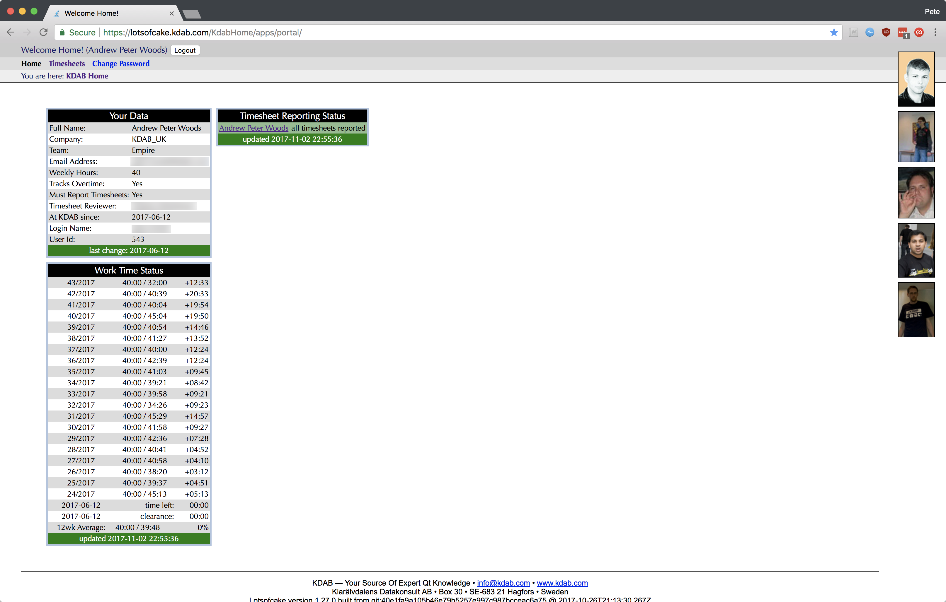
 New home screen
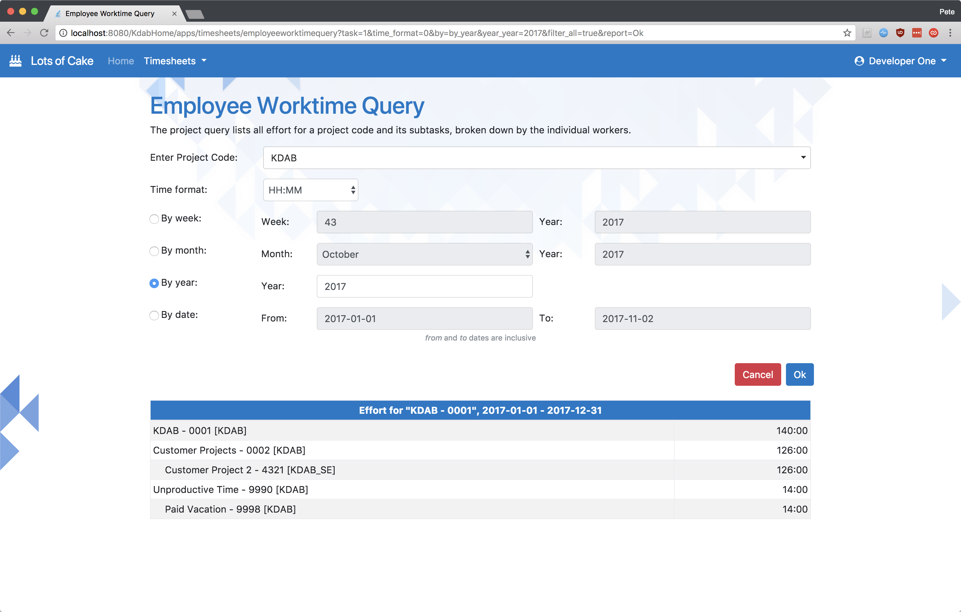
Timesheet screen
The old timesheets screen didn’t respond well to changes in viewport size. Some cells expanded beyound the boundary of the table on small screens, for example. In addition to fixing the complex table-based layouts, I employed a few different tricks to simplify and clean up the layout of this screen.
 Old timesheet screen
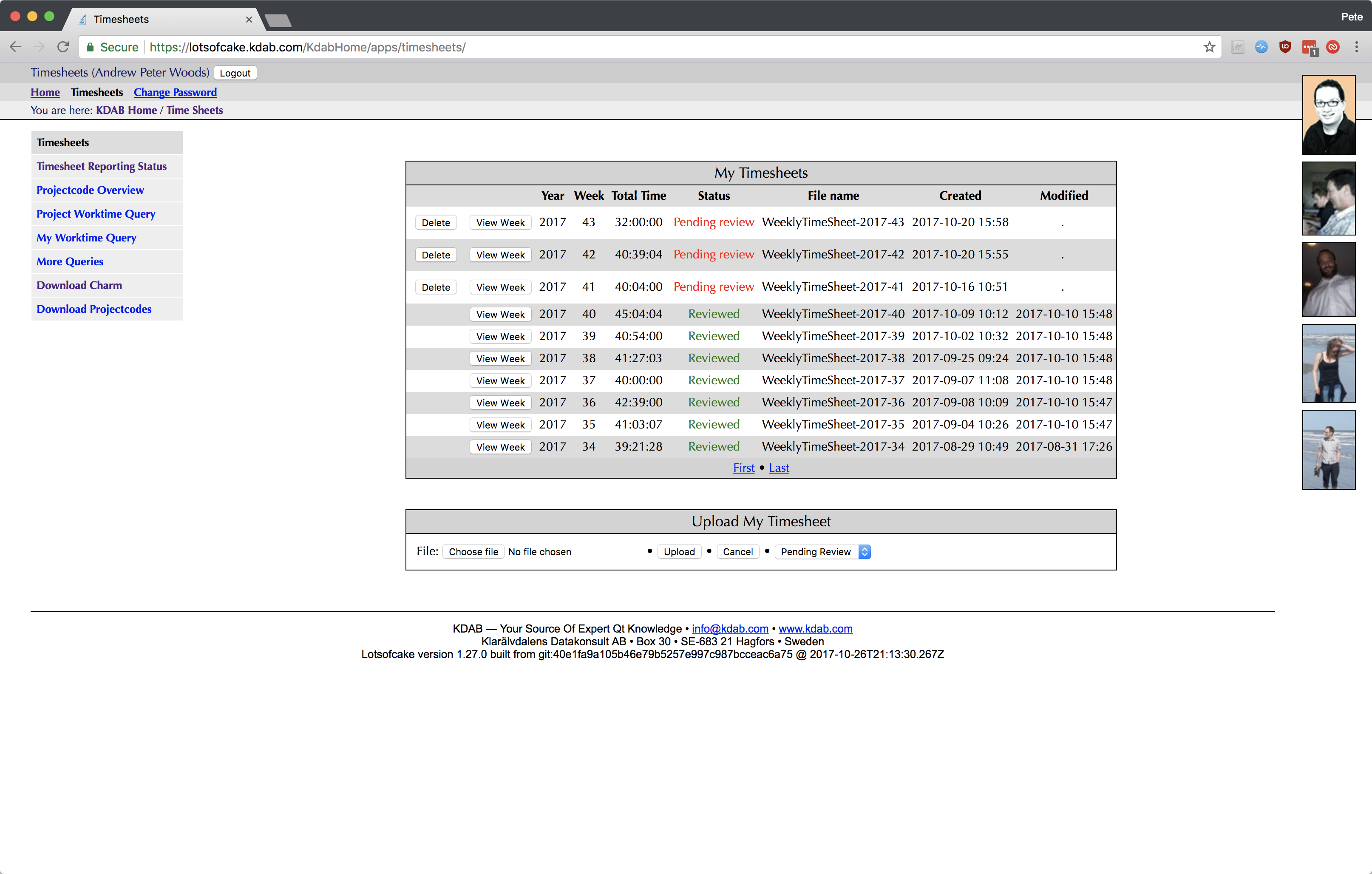
 New timesheet screen
- Move the timestamps into a tool-tip.
- Collapse the row of buttons for each row into a small Bootstrap drop-down button group.
- Hide infrequently-used parts of the UI (manual time sheet upload) behind a modal dialog.
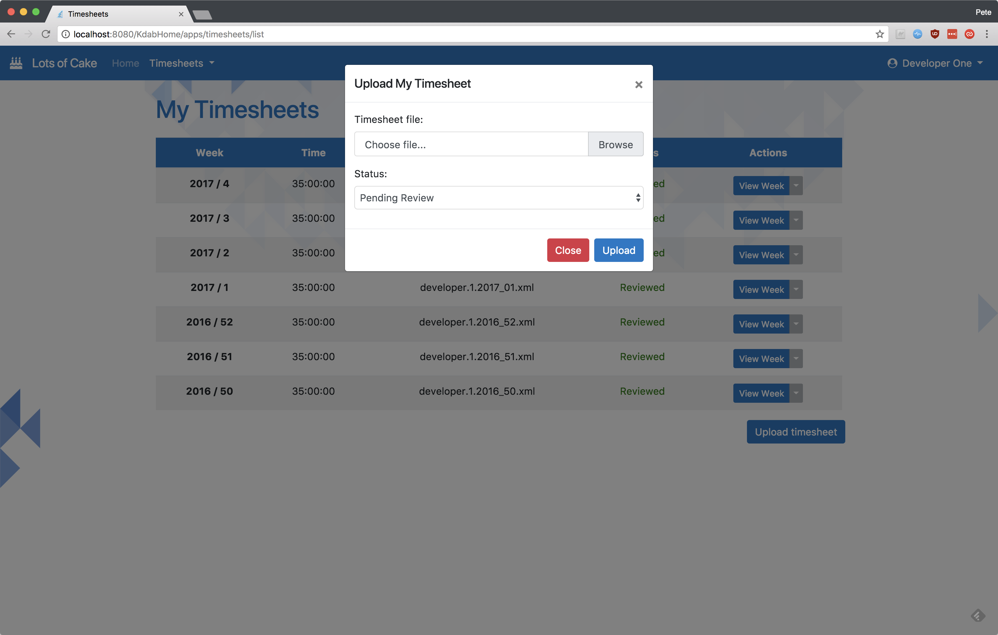 Popup widget for infrequently-used manual upload
Responsive design
Bootstrap does most of the heavy lifting for making your site responsive, particularly with regards to its amazing navbar control, which transforms completely. I also made use of Bootstrap’s display classes to determine the visibility of less important table columns, like so:
1 |
|
See lines 4 and 5, where by default (on a mobile sized screen) the columns are not visible, but I bring them
visible again for certain breakpoints with the combination of e.g. d-none d-sm-table-cell. This results
in the following layouts.
 Responsive login screen
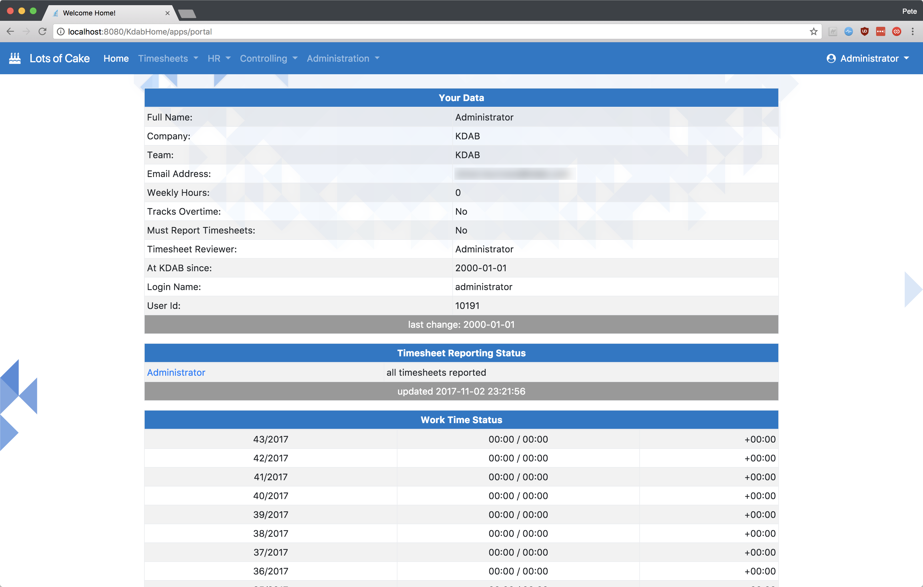
 Responsive home screen
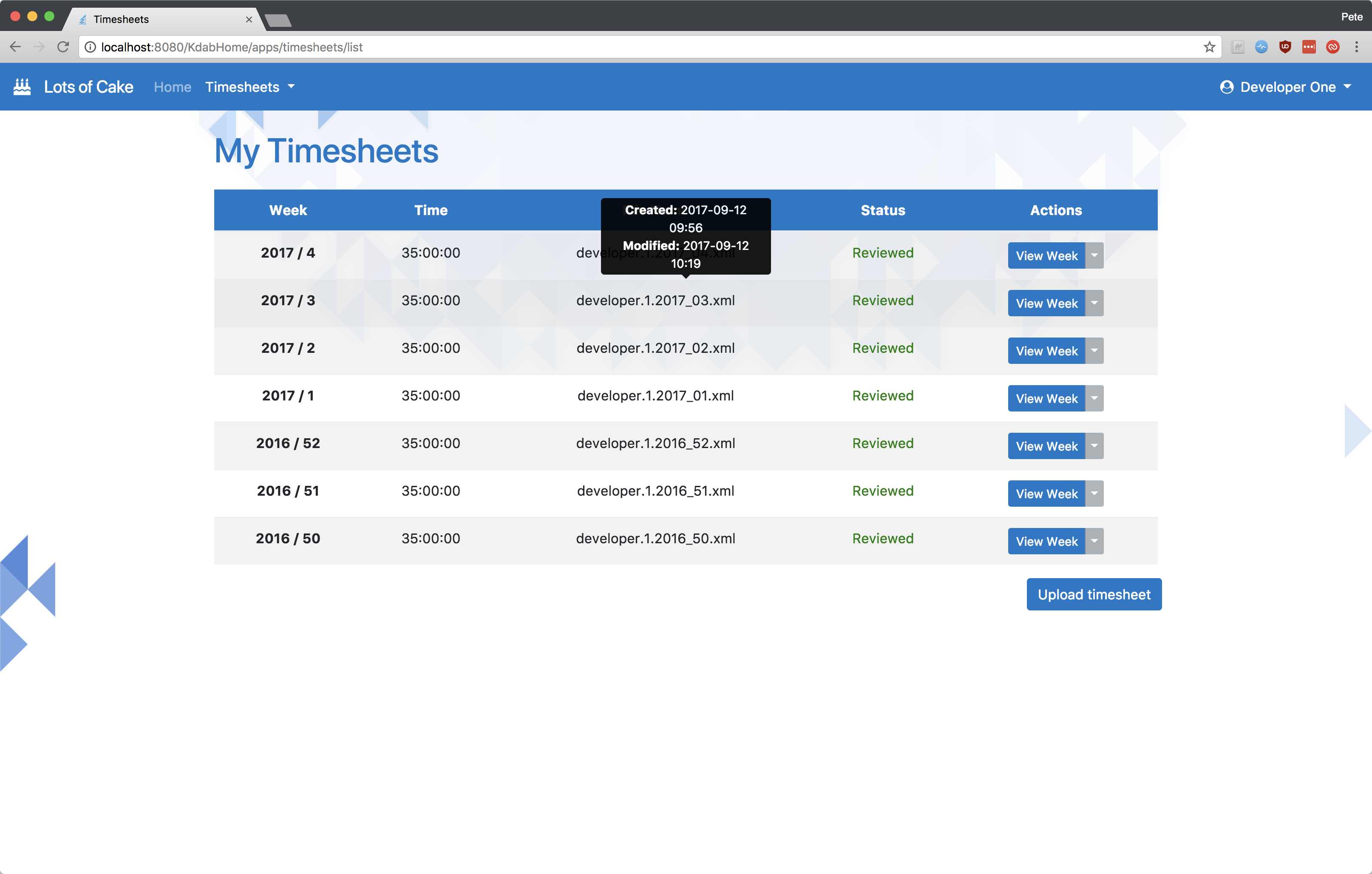
 Responsive timesheet screen
Search screen
The various serach screens in the app benefited from Bootstrap’s form controls. The HTML to create these search screens is quite simple, but the improvement is significant. Again, the screens trivially become mobile-friendly because of Bootstrap.
 Old search screen
 New search screen
Summary
I was able to completely overhaul this site’s UI in a week, so I hope you can see from this that modern HTML/CSS is really easy to get into, and produces pleasing results.
